


TIIP
Railyard 2020 / Research, Brand Strategy, Brand Identity, Naming, Visual Design, Website Design
The Table of Impact Investment Practitioners (TIIP) brings together the expertise and energy of Canada’s social finance fund managers to power more economically generative, environmentally sustainable, socially just and inclusive communities.
TIIP came to us with an incredible network of 35+ social finance leaders across Canada. We were tasked with building a comprehensive, emotionally captivating brand identity and strategic foundation to support TIIP’s robust network in amplifying and accelerating capital into social finance initiatives across the country. We feel honoured to have played a part in bringing their vision to life.
APPROACH

Setting the Foundation
Research
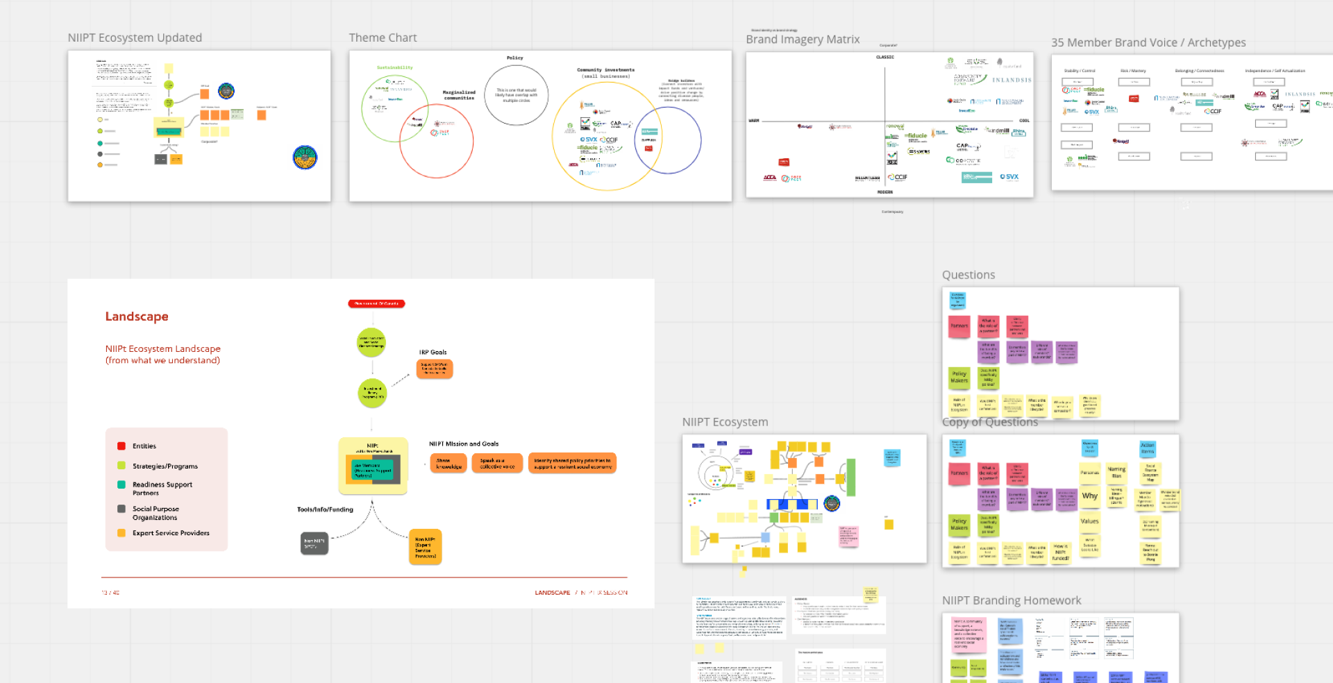
Before diving into the brand strategy, we wanted to solidify our understanding of the social finance landscape in Canada. Who were the key players in the space? What was TIIP’s funding structure? What were some of the trends and challenges we needed to be aware of? Thanks to some guided research and a ‘Social Finance 101’ crash course, courtesy of Steve Patterson, we built a strong grasp of TIIPs' role within the ecosystem. Inspired by TIIP’s mission, we began to hone in on the brand strategy.

Many Voices at the Table
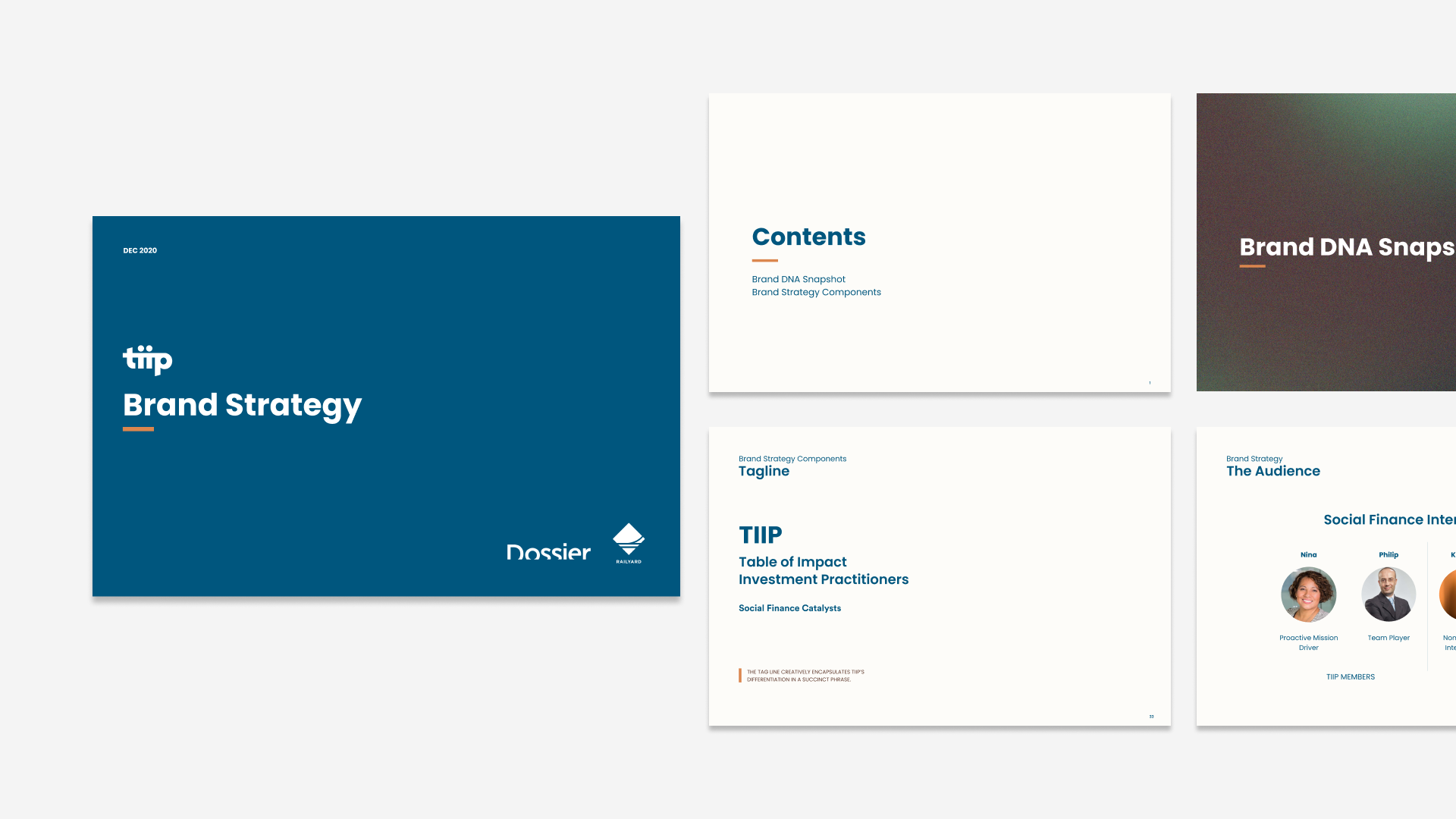
Brand Strategy
The TIIP members came to us with some strong beliefs and a whole lot of passion for their work. Our biggest challenge was building a brand strategy that effectively represented TIIP’s vibrantly diverse community of member-funds, ecosystem partners and policy makers. Many iterations with the TIIP working group allowed us to zero-in on precise word choices to more effectively represent the collective mission of those at the table. We had the amazing opportunity to present the brand strategy to TIIP’s board members who were excited to see the brand come to life!

Brand Equity with a Twist
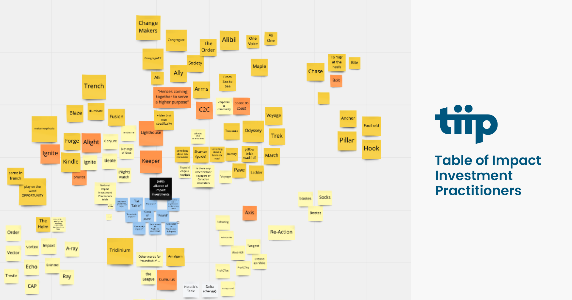
Naming
Another key component of the project was a name refresh. TIIPs previous name, while descriptive, didn’t quite roll off the tongue. As a highly respected and well established community of practice, our challenge was to update the existing name while retaining the brand equity TIIP had developed over the years. We kept the ‘T’ (for ‘Table’) to maintain familiarity and reshuffled the previous acronym to create a simplified name that reflects the brand’s values and personality.


A Community-Centered Approach
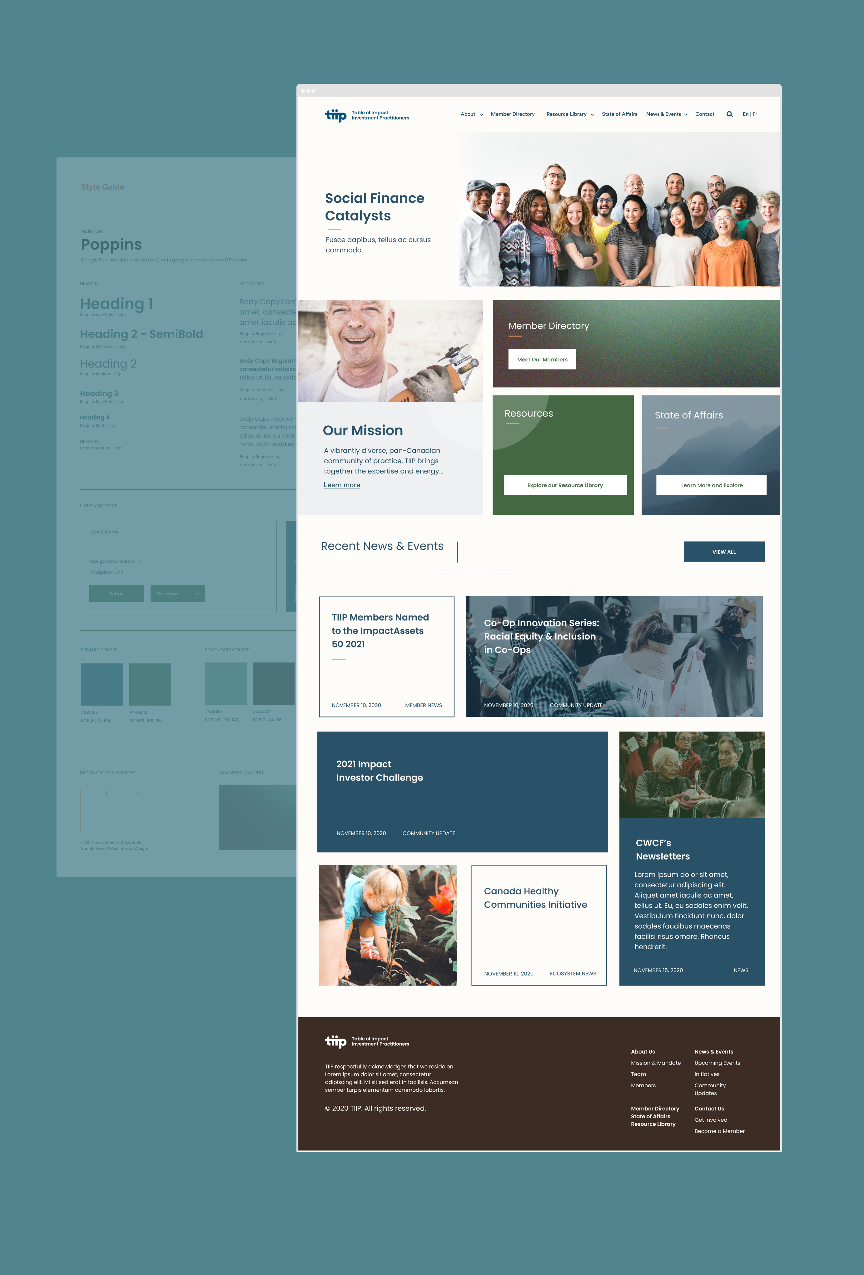
Visual Identity
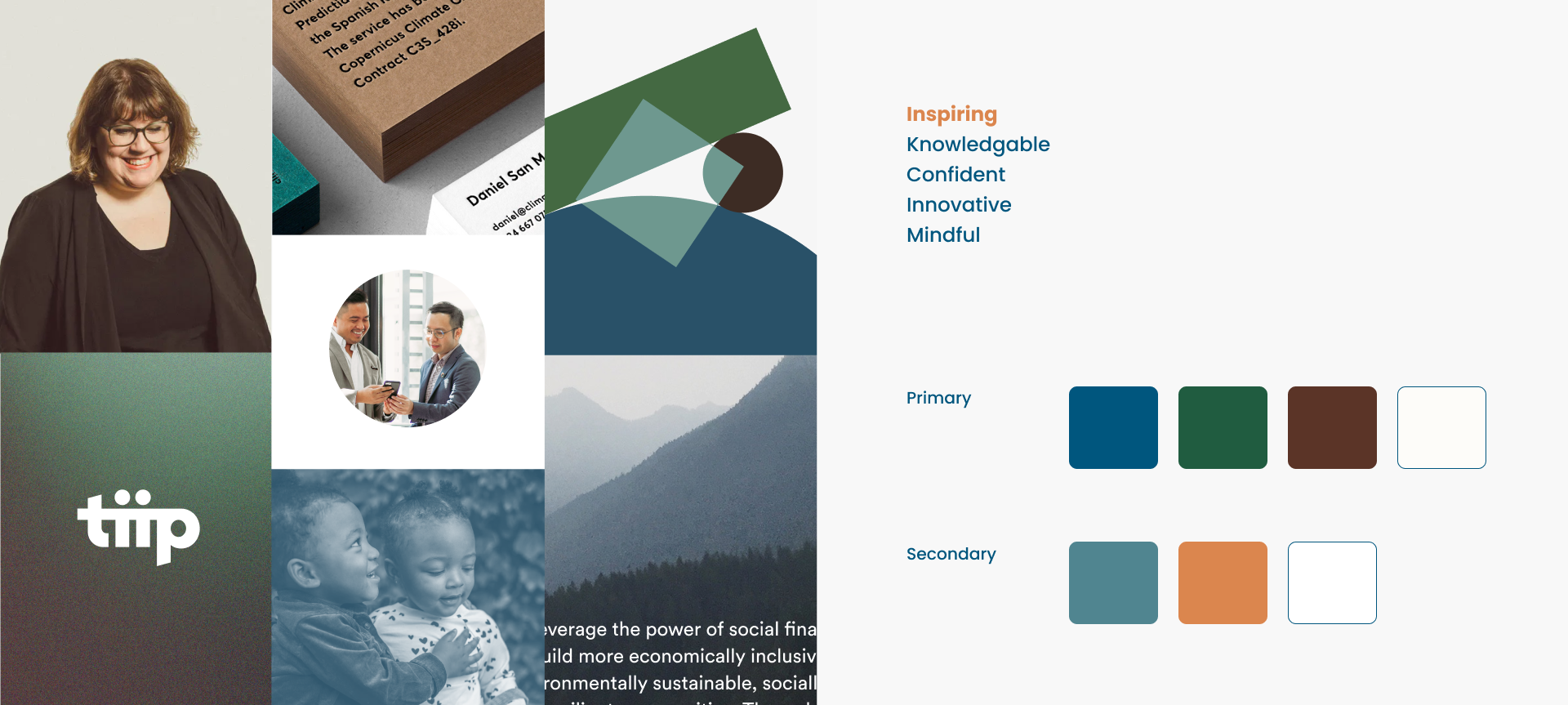
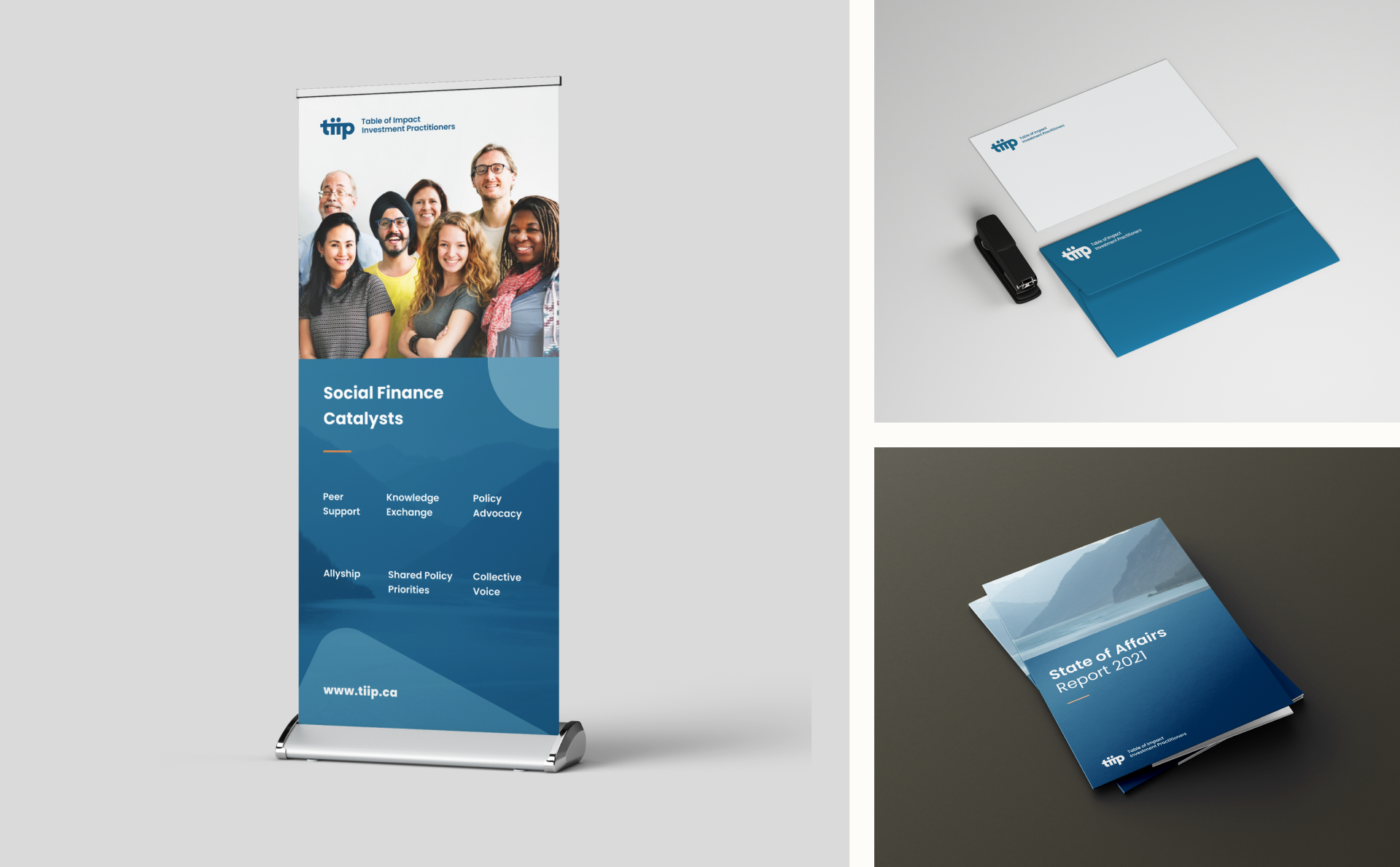
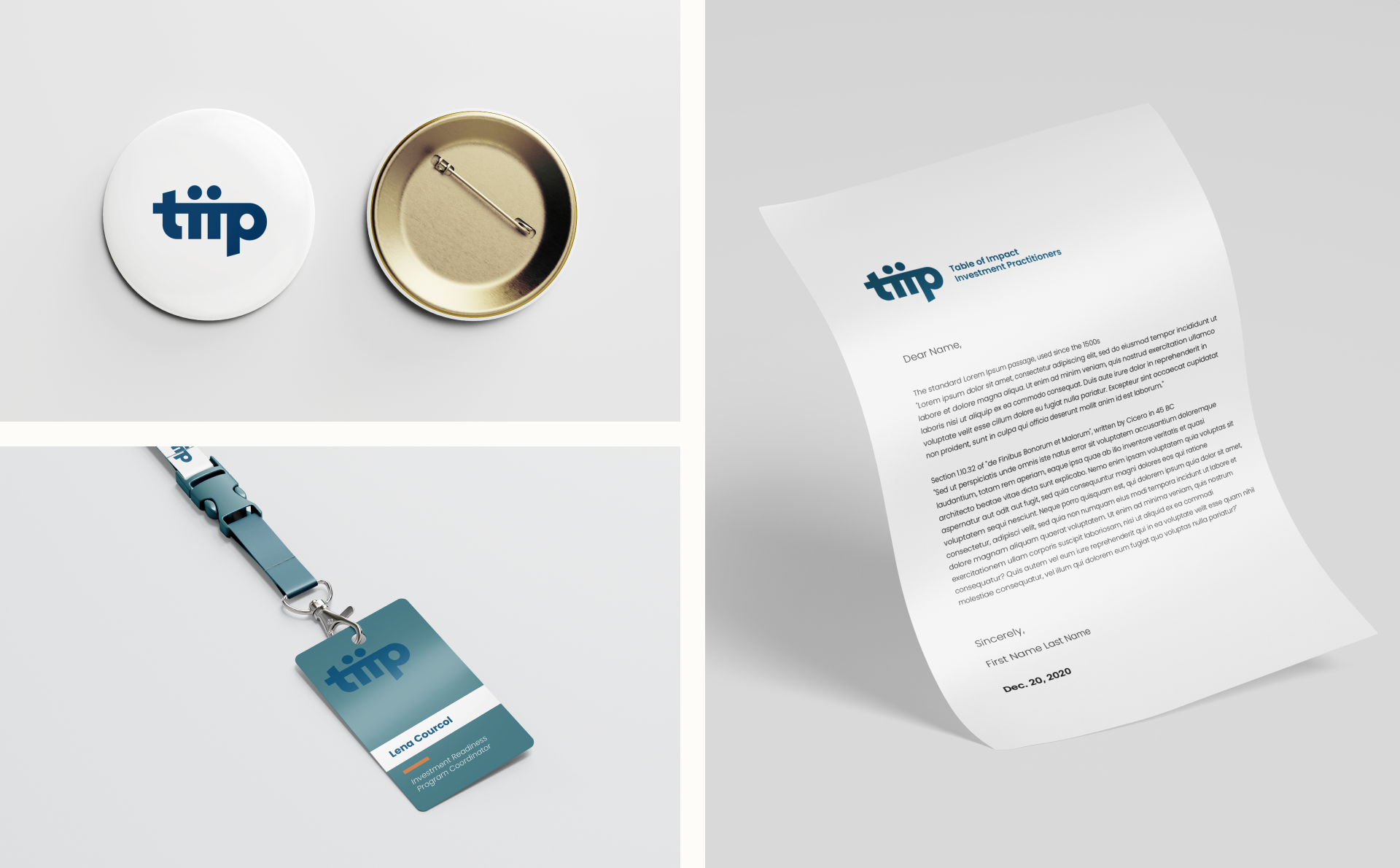
From its inception, TIIP has embodied a people-centred approach to investment. Our task was to go against the grain of the often intimidating financial sector and create a visual identity that made social finance feel inspiring, approachable and mindful. Keeping the blue to maintain professionalism, the updated visual language introduces a grounded color palette to convey the brand’s collaborative and community-based leadership. The orange accents are used to reflect TIIP’s vibrant, confident and innovative characteristics.
Logo
The extended ‘T’ represents a table top while the two ‘i’s’ are used to show the unification and mobilization of TIIP’s members. The upward angles show TIIP’s action-oriented approach to inspiring and driving the social finance movement.


Synthesize & Prioritize
UX Strategy
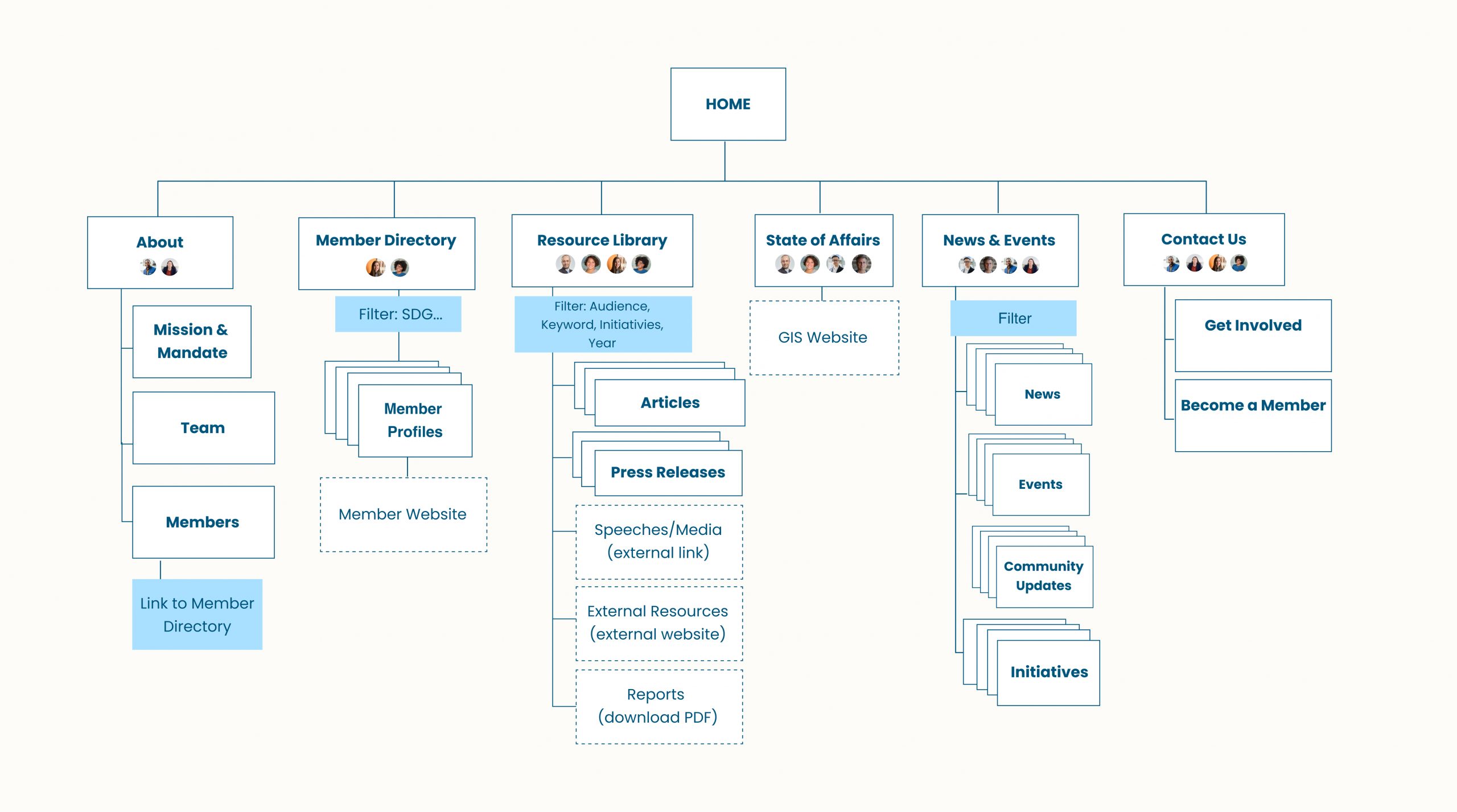
The main goal for the UX strategy was to enable TIIP’s diverse audience to easily navigate relevant resources and directories on the site. Collaborating with the TIIP team, we synthesized and prioritized the goals of TIIP’s stakeholders together to guide the main homepage layout. By clearly defining each CTA for both primary and secondary audiences, we were able to design the content flow of the wireframes to match the motivations of each audience.
Impact
We worked closely with TIIP to develop a brand & creative strategy as well as a new name and logo that supports TIIP’s mission to leverage the multiplier effect of triple-bottom line capital. We are so humbled to have been a part of this incredible organization’s journey.

Shoutout to:
The TIIP working group: Lauren, Lena, Victor, Travis
Steve Patterson for the ‘Social Finance 101’ crash course!
Our advisors/mentors: Sean, Josh and Mica
Testimonials
“It was a consistent delight to work with Dossier Creative’s Railyard team. The Yardies bring an effective blend of deep listening, fertile imaginations and real enthusiasm to the task at hand. Exceptionally receptive and nimbly responsive to input, the team drew our working group into their creative process, and worked hard to design and deliver a “look” that has been warmly received wherever it’s been unveiled.”
Lauren Dobell, Executive Director
“Working with Railyard was an absolute delight! Their iterative process of research, exploration, and creation ensured an end product that captured both the essence and vision of our organization. The Railyard team always managed to ask the right questions, pushing our team to think critically about who we are and what we represent to the different actors of Canada’s social finance ecosystem. From these discussions, the Yardies synthesized the key pieces, incorporated our feedback, and delivered a highly effective creative strategy. The team was always spot on; we were consistently impressed by their professionalism, punctuality, and willingness to go above and beyond! I could not recommend them enough!”