


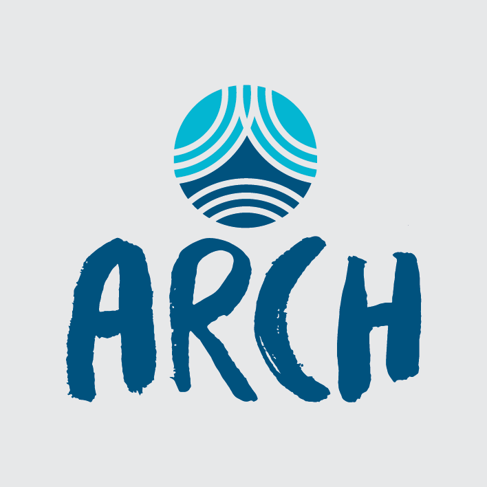


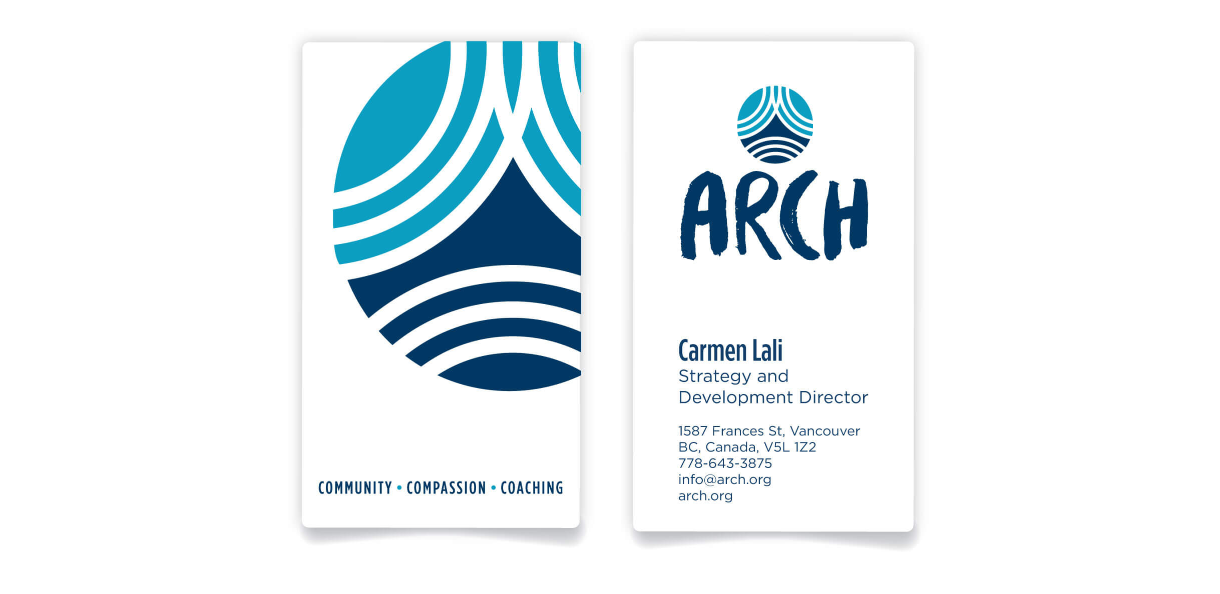
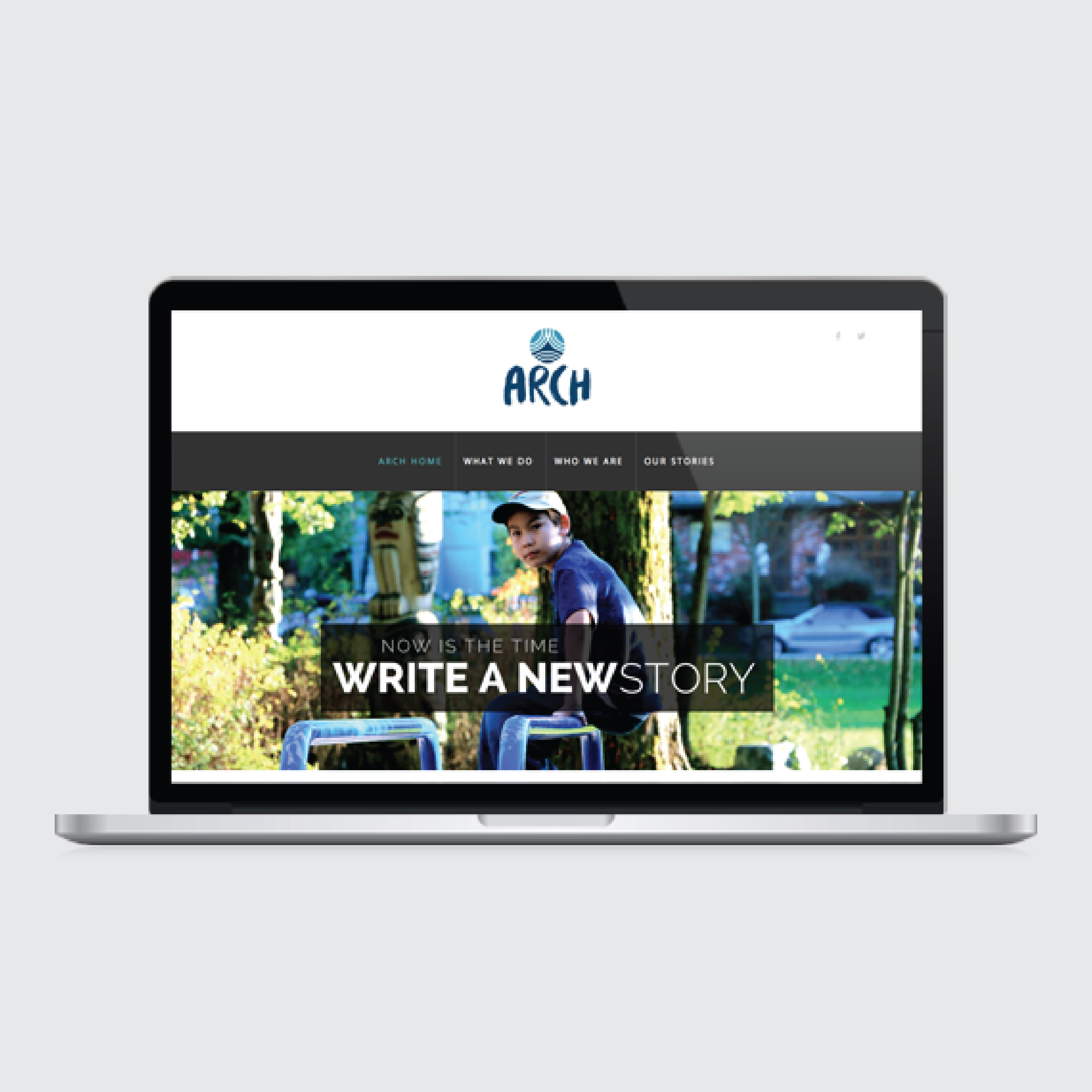
The Arch
Summer 2015 / Brand Strategy, Naming, Brand Identity, Visual Design, Website Design
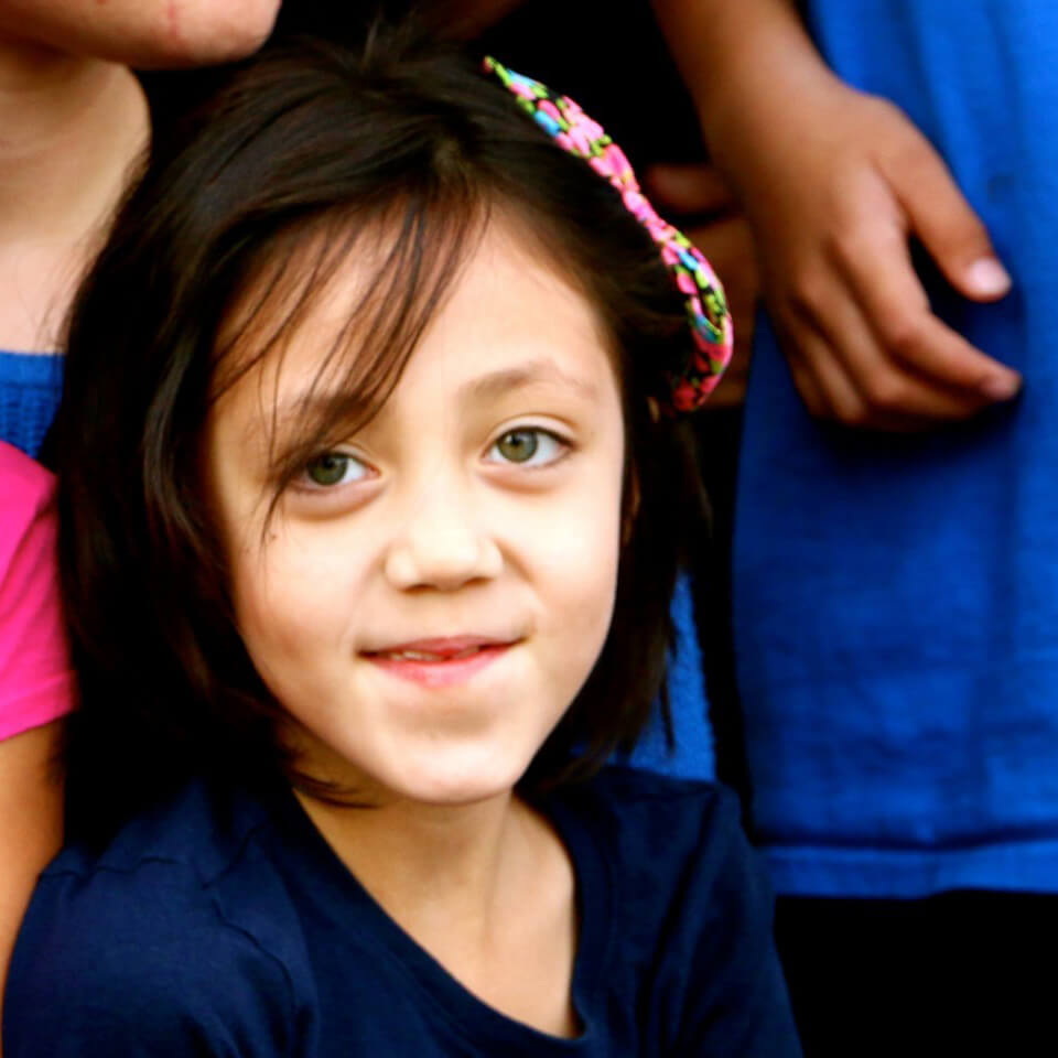
An initiative born out of New Beginnings Fellowship Baptist Church that provides programming aimed at lifting children out of poverty in Vancouver’s Downtown Eastside.


WHY
To re-launch the mission as a fresh, new initiative that is differentiated from the Church, enabling them to align with their target audience and continue to empower moving forward.


HOW
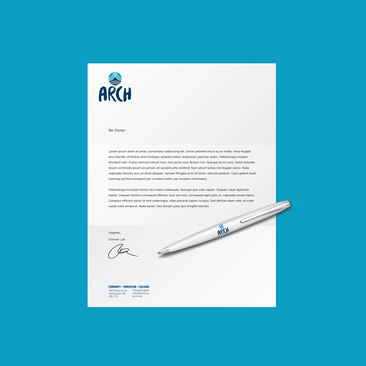
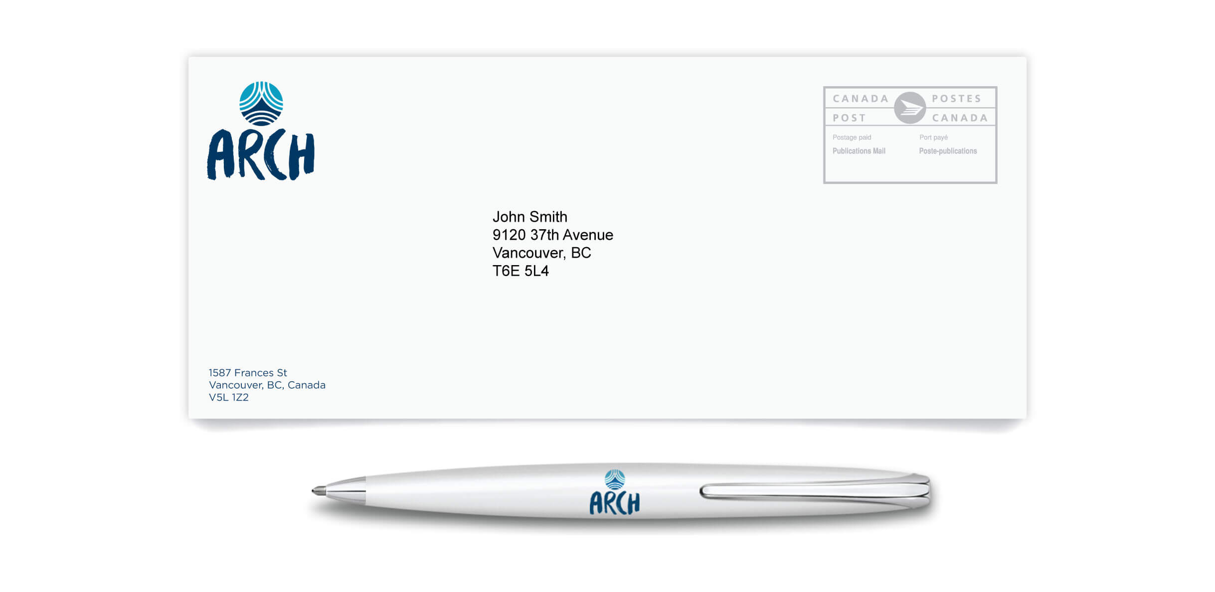
Using information from initial engagement sessions with New Beginnings and conducting research of other organizations in the Downtown Eastside, strategically-aligned naming opportunities were provided. The Arch was born with an identity that emulates the beauty, positivity and support of children in the neighbourhood along with a website that builds on their empowerment work using uplifting imagery and a playful user experience.


IMPACT
An uplifting brand offering that effectively communicates The Arch’s value proposition to both the community it serves and the organizations it engages with.