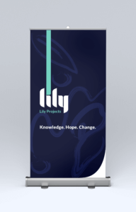
Fabulous news: we finished The Lily Projects branding for our client Kisa Macdonald as of late June! That makes one of two client projects complete for summer 2017. Below you will find some of our major takeaways and process.
The Problem
 Kisa is a driven Vancouver artist and legal practitioner with experience in curation, legal research, and writing. The Lily Projects was named for 3 Lilies she met during her work with sexual assault survivors. Through them, she discovered how flawed the systems are, and how hard it is for survivors to seek help.
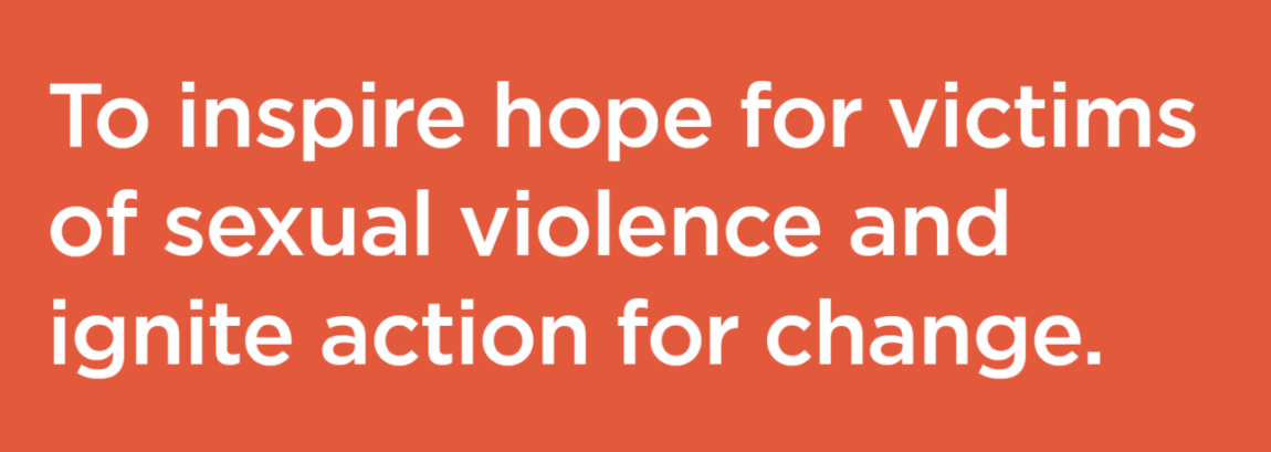
So, when Kisa came to us, The Lily Projects was just beginning. Her passion had already earned her collaborators, but they did not yet have traction. Our job was to help her secure funding by creating a brand identity, business model, and comm. strategy.
Challenges and Rewards

One of the most challenging sides of this project was wrapping our heads around the wicked hard problems surrounding the Legal System - something beyond the capability of a single non-profit society. We conducted interviews with survivors and gathered Canadian statistics and research. We discovered most Vancouver sexual assault support organisations serve only females, and some have strained relationships with trans-women. We also found Canadian and BC laws are actually incredibly progressive, but practise has not caught up. These, among others, helped us define a distinct gap for The Lily Projects to fill.
Ronna also organised an external advisory meeting with Railyard alumni, experts, and strategists including UVIC Professor and Director David Dunne, IBM UX designer and former Yardie Stevie Nguyen, and social service and non-profit specialist Julia Kochuck, and SAP's David Choy (needless to say, we were nervous!). This meeting was a turning point for us, and made us realise we had spread too thin. We had confused our audience, and in that moment, we felt the wind suck out of our sails. We had to stop and rethink our strategy.
Lesson learned: you can only do so much over the summer. Don't plan too far ahead with a brand or your work may suffer for it. Think in the now, what does your brand need now? But still consider how can you also make it easy for it to expand and grow in the future.
Our Logo
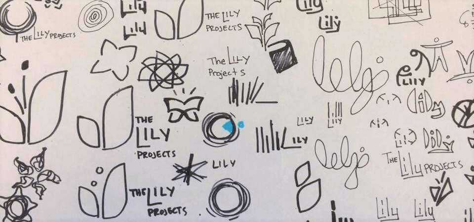
Kisa liked to say, "it's like you took my jumbled plate of spaghetti and lined up all the noodles in neat rows". Kisa has a lot of ideas and strong beliefs, which is fantastic, but trying to fit that all into the initial branding is tough. We pulled what we agreed to be the most vital and developed a logo mark with an upward, positive movement; inspired by bold justice and graceful lilies. We did our best to avoid being overly feminine, as the brand would serve all genders, races, and beliefs. You can see some of the mark's development below. Also, boy oh boy, do Brand Guidelines take longer than we anticipated!


