Hello Interwebz, Robbie here!
What a great opportunity and pleasure it was to work with ACTS, on a lite rebrand! What is ACTS? Well I’ll tell you, it’s a well established charity that provides clean drinking water to rural Ugandans. Throughout their 22 years of active involvement, they have been able to provide water to 150,000 rural Ugandans. For those who aren’t familiar, you can check out their website at ACTS.ca. At the moment they are rebuilding their site to fit the new branding we just completed.
ACTS approached Railyard to do complete the lite rebrand in hopes of reaching a younger demographic while at the same time maintaining the older donors that have supported them for many years.
Dossier allowed us to utilize their design process which helped us execute a timeline and plan which would deliver the best identity possible for ACTS. The process follows the idea of diverging and converging which is repeated through the design development. This allows us to provide a variety of options while at the same time filtering by allowing the client to select a design direction.
DISCOVER
During the ‘discover’ stage, we provided ACTS with a brand DNA package to fill out. With the Brand DNA, we are able to start to identify how the client wants to be portrayed by the public and as well how they see themselves. It is an amazing tool to help us start to define a direction and what directions not to take.
IDEATE
The ‘ideate’ stage allowed us to take what we found to be the most important parts of the brand DNA and start to visualize what our possibilities may be in terms of typography, iconography, colours, photography and marks. With these we created two separate creative corridors that we presented to ACTS.
CREATE
Once a creative corridor was chosen, we were able to begin the fun part by sketching out logos. Using the creative corridors as a springboard for inspiration and reference of what ACTS liked and didn’t like we did a lot of process work. With the help of Dossier’s design director Pat Smith, we were able to provide ACTS with three logos options.
REFINE
After a selection was made by ACTS we did two rounds of refinement to perfect the new ACTS logo.
EXECUTE
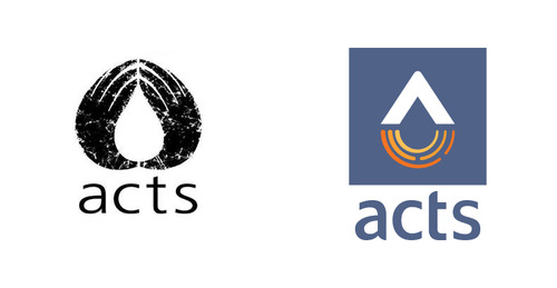
Finally, we were able to present the final files to ACTS. We are very proud of the final logo selection, it represents so much with so little. The water droplet in the negative space alludes to the their mission while the ripples underneath represent growth, prosperity and change.
OUTCOMES AND LEARNING
I really wanted to take this opportunity to take in everything from this process. Being from a degree that isn’t graphic design, I have always felt like I need to work harder and learn as much as I can in order to make do well.
THE TRANSFORMATION:
Now a word from Jessica:
I really enjoyed working on this project and watching Robbie go through the design iterations. Robbie worked a lot with Pat Smith, a senior designer on Dossier’s team, to create a brand for ACTS that is both refreshing and revolutionizes the brand. Of course, since I do not have any design experience, I was working on my project management and copywriting skills :D.
What I enjoyed most, was working with Pat Ho, Dossier’s strategist, to develop ACTS’ brand DNA and how it can be communicated to their donors and followers. It was challenging to step outside myself to write about another organization’s internal values. What helped was having a client who knew the organization inside and out. Nate, ACTS’ Executive Director, has high expectations for where ACTS can go in the future years and he portrayed that when we had a dialogue session about his own perspective on ACTS’ brand DNA. I can see how having a voice outside of your organization or circle can play a huge part in developing an organization’s values to be communicated: I had the opportunity to bring clarity to ACTS’ brand, and I hope I did a good job!
That’s all for now! Toodle-loo!
Published by: Reg Dick in Behind the Scenes, Brand Identity, Brand Strategy