
Fascinating opinions from the renowned graphic designer Milton Glaser; a fun and thought provoking read:
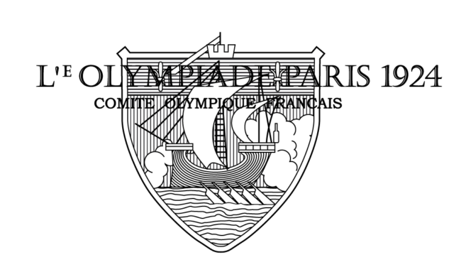
Paris – Summer Olympics 1924
Bad beginning, the elements are unrelated visually and the imagery is confusing. The surprinted lettering is unreadable.
Score: 20 out of 100
Source:
eyeondesign.aiga.org